We are always talking about "cropping" a photo to fit a scrapbook layout, but sometimes we need to expand a photo - whether it is to accommodate more space on the layout page or to add an interesting aesthetic feature to the layout. Expanding a photo is quick and easy to do and it is one of my favorite ways to accentuate a scrapbook layout.
All you have to do is take your photo and cut it into even sized pieces! Sounds a bit shaky, but take a look at this scrapbook layout and the close up of the expanded photos.
All you have to do is take your photo and cut it into even sized pieces! Sounds a bit shaky, but take a look at this scrapbook layout and the close up of the expanded photos.
The Layout
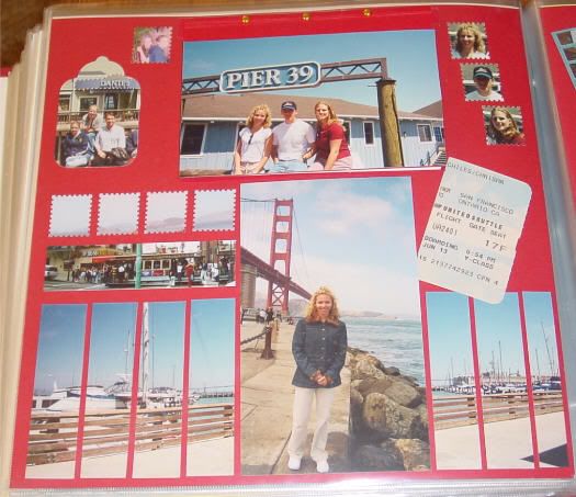
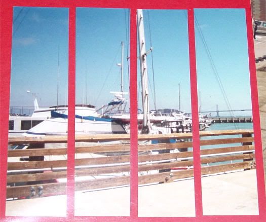
This is a layout I did for my daughter when she went to San Francisco, CA for the first time. The photo itself was a 4x6 size photo. It is of the coast line with fishing boats. Just the photo alone, was too plain. I wanted to add something to it.
Cut and Seperate (cringing at this point is acceptable, but stick with it!)
After measuring, I cut the photograph into sections. They are all equal sections except for the last one, slightly smaller because I ran out of background space! Each section is 1 inch wide. I didn't matte the photo, just layed it out on the background page. Make even spaces between each photo piece and voila! An expanded photo, fills the required space on the layout and adds quite the charm to the theme of the layout.
The Aesthetic Issues
This method of scrapbooking accomplishes 2 aesthetic issues. First, the photo takes up a lot of space, while keeping the theme and streamline of the layout, without making it look cluttered. Secondly, it makes the photo "appear" to be matted, when it is not. Both of these additions make for a very interesting, eye-catching scrapbook layout page!
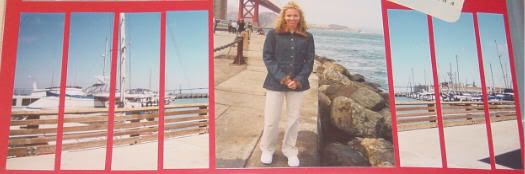
Do It Vertically, too!
You can also do this method using vertical photographs! This photo, I cut into 1/2 inch strips and placed them evenly spaced on a contrasting color cardstock matte and then placed that whole ensemble onto the layout. Again, quite an aesthetic eye catcher! Now as for the color of cardstock you use, that is your decision. I didn't use a color from the photo as I thought that would just blend to much and you wouldn't be able to see the continuity of the photo. I chose the blue as that was main color in the other photos - the blue sky - so I stayed with that shade and just used a different hue. The blue I used is soft, suttle and blends very well with the images and colors of the photo. You can still plainly see the full photo but it has the little bit of expression in there. So just pick and choose, trial and error which color cardstock that would look best on your layout.

I would venture to say that expanding photos would be best if kept to scenery or objects, but if you have extras or can make copies, give it a try on any subject. You never know what you might come up with!


1 comment:
Now that was really interesting! Who would of thought! You have such great idea's.
Thanks.....Judy in Texas
Post a Comment